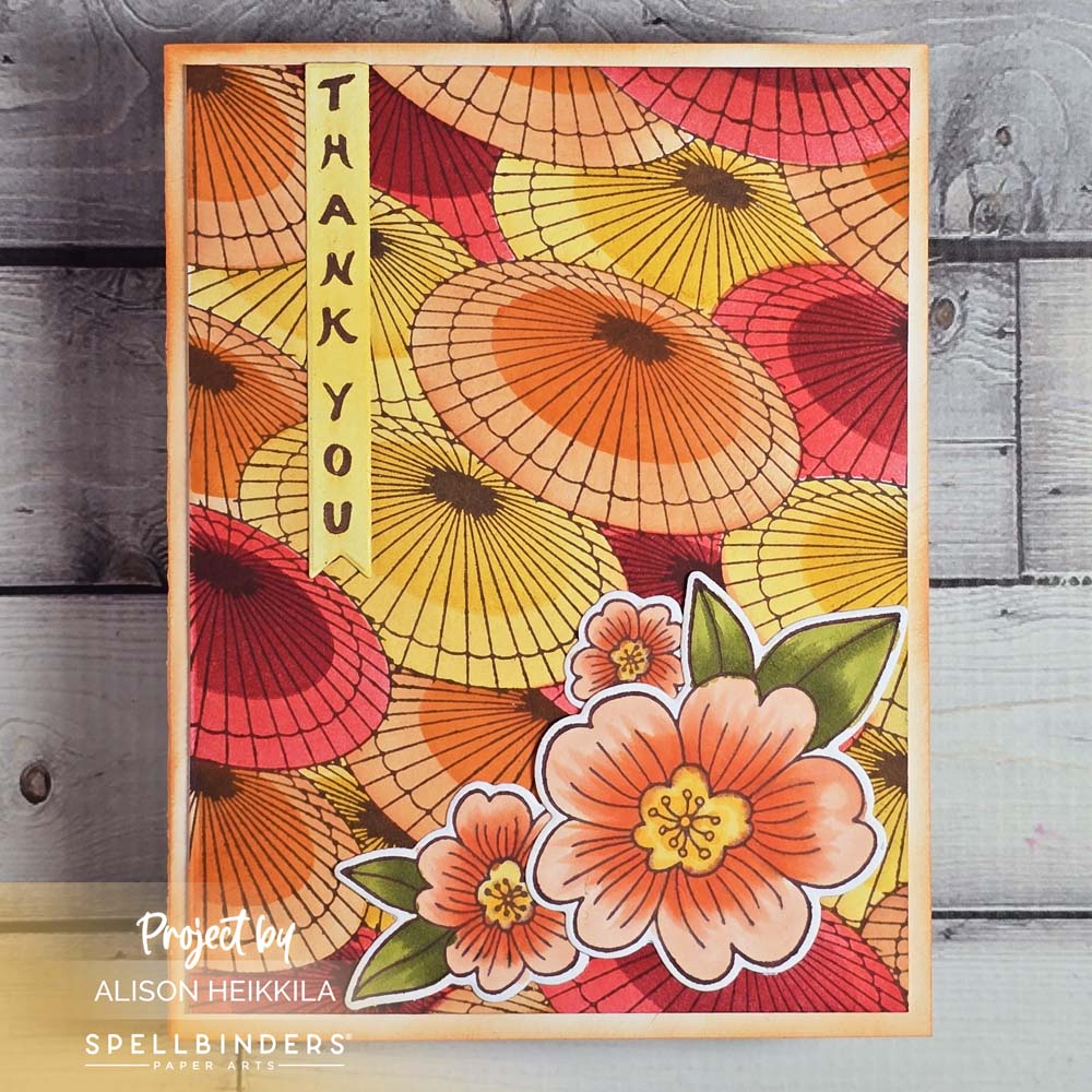
Hello! It’s time for a new episode of my Pick a Palette Series: Color Theory with the Zollie Palette Scout. This time, my starting point was Tiki Torch Ink from Catherine Pooler, and I opted to go for an analogous color palette. I decided to use these colors with some of the new products from the Spring in Kyoto Collection from Spellbinders & Alex Syberia. This collection is amazing, and I can’t wait to show you more projects with it.
*Some affiliate links are used in this post. That means that if you shop through these links, I may receive a small compensation, at no cost to you. For more information, please see my Affiliates page, where I also have some coupon codes.
Here is the YouTube video. If it doesn’t play properly, please click HERE.
Supplies:
Zollie: Palette Scout
Spellbinders: Spring in Kyoto BetterPress & Stencil Bundle
Spellbinders: Blossoms & Sentiments BetterPress Plate & Die Set
Spellbinders: BetterPress System
Catherine Pooler: Tiki Torch Ink
Catherine Pooler: Tutti Frutti Ink
Catherine Pooler: Tiara Ink
Catherine Pooler: Orange Peel Ink
Ranger: Aged Mahogany Distress Ink
Ranger: Fossilized Amber Distress Ink
Imagine: Acorn VersaFine Clair Ink
Copics: YG95, YG97, YR02, YR61, YR68, Y17, Y21
Gel Press: 6×6 Plate (optional)
Joggles: 8×8 Acrylic Stamp Mount (optional)
Scrapbook.com: Medium Blending Brushes
Crane’s Lettra 100% Cotton Cards 110lb.
Accent Opaque: 100lb. White Cardstock
Bearly Arts Glue
The Palette Scout made it so easy to choose beautiful, harmonious colors for this card. And they’re all showcased wonderfully because of the fantastic parasols. Please check out the Spellbinders website to see not only the rest of the Spring in Kyoto Collection, but all of the ither new releases as well. Thanks for stopping by. Have an inspiring day!
Thank you so much for your kind words!